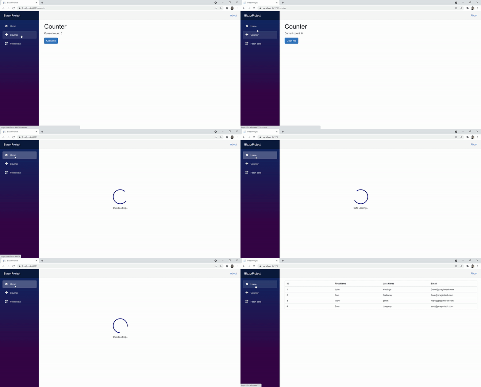
Loading animation in web application | Blazor

In this video we will discuss how to display loading animation in a Blazor web application.
In a real world there are many usecases where we need a loading spinner or indicator. For example
- Your app is processing a report and it takes a few seconds to complete or
- A server-side REST API is being called and it's taking a few seconds to retrieve data maybe because of a slow network connection, server busy or just because you are retrieving lots and lost of data.
Whatever maybe the case, if your app is taking a bit of time to do something it's better to display a loading indicator so the enduser knows the application is busy processing the request and not frozen.
Syncfusion Blazor Spinner Component
It's very easy and simple to use Syncfusion Spinner component in your Blazor Webassembly app. The following are the steps.
Install Syncfusion.Blazor.Spinner NuGet package
In index.html, include the following link to reference the bootstrap4 CSS file
<link href="_content/Syncfusion.Blazor.Themes/bootstrap4.css" rel="stylesheet" />In _Imports.razor file include the following using declaration
@using Syncfusion.Blazor.SpinnerIn the Main() method in Program.cs file, make sure Syncfusion Blazor services are added.
public static async Task Main(string[] args)
{
    Syncfusion.Licensing.SyncfusionLicenseProvider.RegisterLicense("Your_LicenseKey");
    //....

    builder.Services.AddSyncfusionBlazor();
    //....
}
Finally use the spinner component in any of your application razor pages or components.
@page "/"
@using BlazorProject.Shared
@using BlazorProject.Client.Services

@if (Employees == null)
{
    <SfSpinner Visible="true">
    </SfSpinner>
}
else
{
    <SfGrid DataSource="@Employees">
        <GridColumns>
            <GridColumn Field=@nameof(Employee.EmployeeId) HeaderText="ID"></GridColumn>
            <GridColumn Field=@nameof(Employee.FirstName) HeaderText="First Name"></GridColumn>
            <GridColumn Field=@nameof(Employee.LastName) HeaderText=" Last Name"></GridColumn>
            <GridColumn Field=@nameof(Employee.Email) HeaderText="Email"></GridColumn>
        </GridColumns>
    </SfGrid>
}

@code{
    public List<Employee> Employees { get; set; } = null;

    [Inject]
    public IEmployeeService EmployeeService { get; set; }

    protected override async Task OnInitializedAsync()
    {
        await Task.Delay(3000);
        Employees = (await EmployeeService.GetEmployees()).ToList();
    }
}
Loading Spinner Type
By default, the Type is None where the Blazor Spinner is loaded based on the theme used in the application. The available types are:
- None
- Material
- Fabric
- Bootstrap
- HighContrast
- Bootstrap4
<SfSpinner Visible="true" Type="@SpinnerType.Bootstrap4" Label="Data loading">
</SfSpinner>
Loading Spinner Size
By default, the Spinner size is 30px but you can increase or decrease depending on your application requirements.
<SfSpinner Visible="true" Type="@SpinnerType.Bootstrap4" Size="100" Label="Data loading">
</SfSpinner>
Loading Spinner Color
Include the following style in your component to change the colour of the spinner to red
<style>
.e-spinner-pane .e-spinner-inner .e-spin-bootstrap4 {
    stroke: red;
}
</style>
Control Spinner visibility through a two-way binding property
<SfSpinner @bind-Visible="SpinnerVisible" Type="@SpinnerType.Bootstrap4" Size="50" Label="Data loading">
</SfSpinner>

@if (Employees != null)
{
    <SfGrid DataSource="@Employees">
        <GridColumns>
            <GridColumn Field=@nameof(Employee.EmployeeId) HeaderText="ID"></GridColumn>
            <GridColumn Field=@nameof(Employee.FirstName) HeaderText="First Name"></GridColumn>
            <GridColumn Field=@nameof(Employee.LastName) HeaderText=" Last Name"></GridColumn>
            <GridColumn Field=@nameof(Employee.Email) HeaderText="Email"></GridColumn>
        </GridColumns>
    </SfGrid>
}

@code{
    public List<Employee> Employees { get; set; } = null;

    [Inject]
    public IEmployeeService EmployeeService { get; set; }

    public bool SpinnerVisible { get; set; }

    protected override async Task OnInitializedAsync()
    {
        SpinnerVisible = true;
        await Task.Delay(3000);
        Employees = (await EmployeeService.GetEmployees()).ToList();
        SpinnerVisible = false;
    }
}
© 2020 Pragimtech. All Rights Reserved.

